Light, Shape, and Scent Aligned with Your Interior

Step into a world where candles become design companions, shaping mood, color, and texture to match your rooms with effortless grace. We explore candle and decor pairings by interior design style, translating Scandinavian restraint, industrial grit, coastal breeze, and bohemian freedom into practical arrangements, soulful scents, and memorable rituals. Discover placement strategies, palette suggestions, safety know-how, and lived-in anecdotes, so you can curate vignettes that glow beautifully every day and impress effortlessly when the doorbell rings. Leave a comment, share a photo, and let your spaces shine.

Style-First Candle Choices

Begin by reading the room before lighting a single wick. Forms, finishes, and silhouettes should echo the architecture and furniture language already present. In a tall-brick loft, stout pillars soften steel edges; in a calm Nordic living room, slim tapers keep lines pure. Consider burn time, wick type, vessel material, and scent intensity as design decisions, not afterthoughts, ensuring each flame supports conversation, comfort, and the subtle story your home already tells with confidence.

Farmhouse and Cottage Warmth

Favor beeswax pillars with a natural golden cast, paired with cream tapers and weathered wood accents. Terracotta, stoneware, and iron create a tactile trio that suits woven throws and painted beadboard. Choose bakery-adjacent scents sparingly to avoid competing with real cooking; instead try apple peel, herb gardens, and soft smoke. Cluster candles on a reclaimed breadboard, keep flames three inches apart, and invite cozy storytelling over steaming mugs after long, rain-soaked afternoon walks.

Mid-Century Pops Without Clutter

Let color punctuate, not overwhelm. Jewel-toned tapers in teal or saffron energize walnut or teak, while low, wide vessels maintain sightlines across sculptural chairs. Choose streamlined brass holders with crisp geometry and let one saturated accent repeat in cushions or artwork. Citrus and green fig scents feel era-appropriate, bright, and unfussy. Maintain negative space, avoid fussy doilies, and keep cords hidden so the glow highlights graceful legs, curves, and timeless silhouettes with thoughtful restraint.

Coastal Airiness and Reflective Light

Keep things weightless with sea-glass hues, whitewashed holders, and clear hurricanes that protect flames from salty breezes while amplifying shimmer. Choose airy notes like salt, bergamot, and eucalyptus that energize without overpowering open windows. Place candles near reflective ceramics, shells, or driftwood sculptures, spacing generously for breeze-friendly safety. Finish with linen runners and rope textures that nod to nautical history while maintaining a laid-back, barefoot atmosphere perfect for sunset gatherings and slow weekend brunches.

Color Palettes and Finishes that Harmonize

Color and finish turn a nice setup into a resonant composition. Pull hues from rugs, artwork, or upholstery, then echo them subtly in tapers, wax tints, and holders. Brushed brass warms leather; glazed earthenware cools saturated walls; clear glass multiplies seaside light. Use saturation carefully where lines are clean, and restrain contrast when patterns already sing. Let sheen decisions do quiet work, bridging lamps, frames, and hardware into a unified, polished, welcoming conversation.

Scent Mapping by Room and Style

Treat fragrance like lighting: layered, directional, and intentional. Calibrate intensity by square footage and ventilation, and prevent clashes by selecting complementary families throughout adjacent spaces. Anchor living rooms with welcoming woods, keep kitchens bright and food-friendly, and reserve bedrooms for restful, low-throw blends. Remember first-burn rules for even melt pools, crack a window after extinguishing, and always test new combinations during a quiet evening before hosting, ensuring harmony instead of sensory overload.

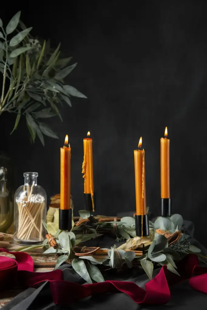
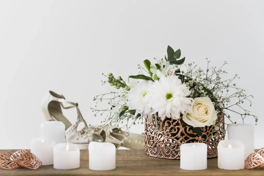
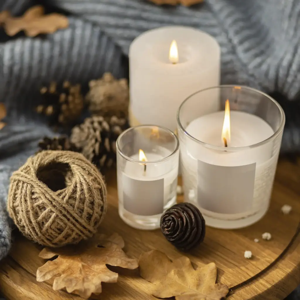
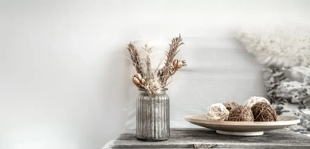
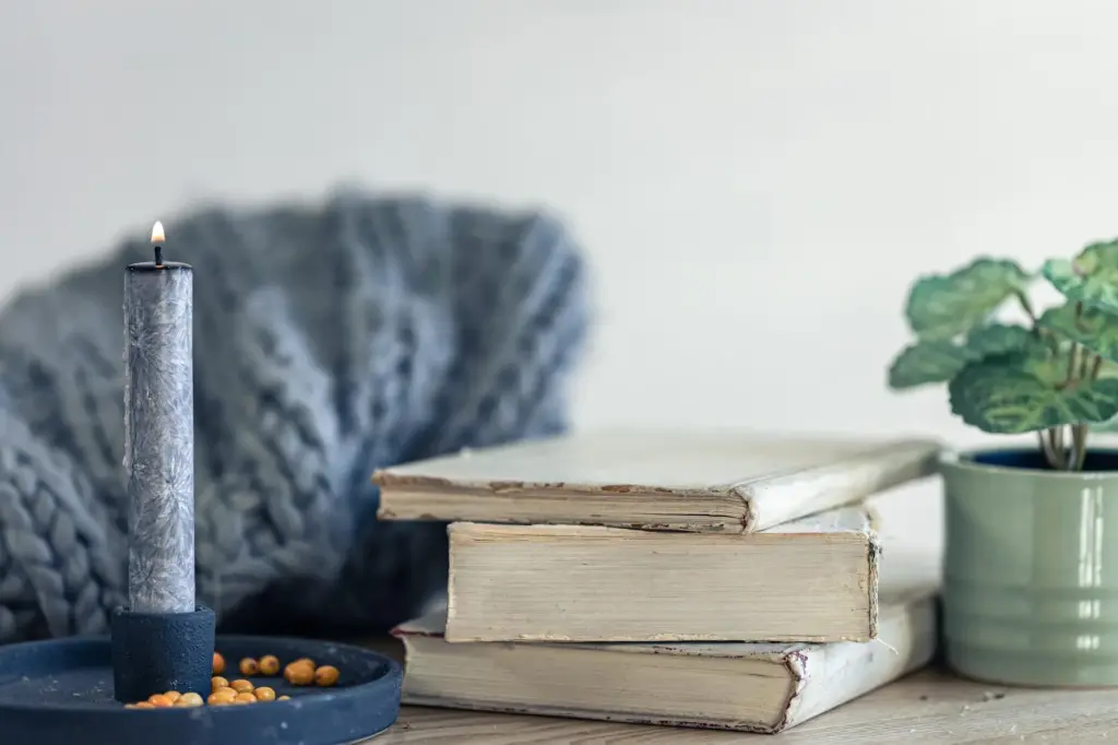
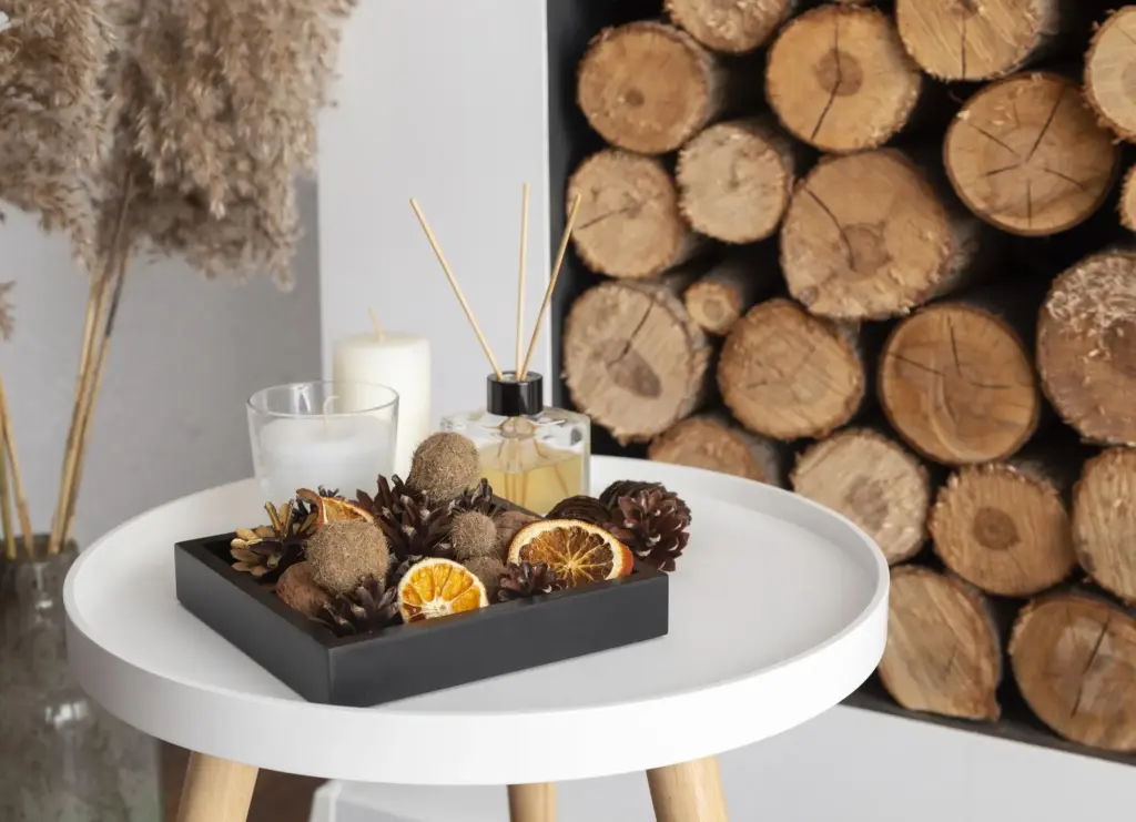
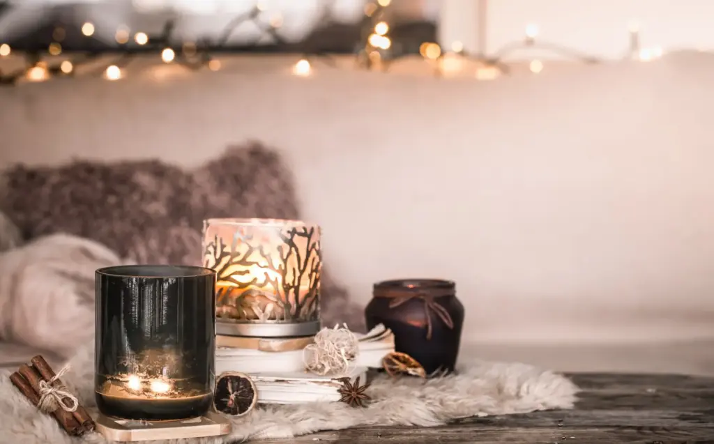
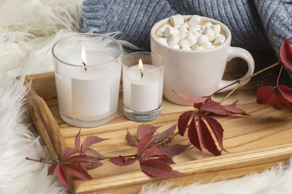
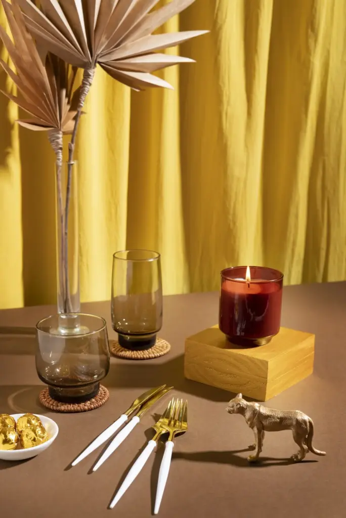
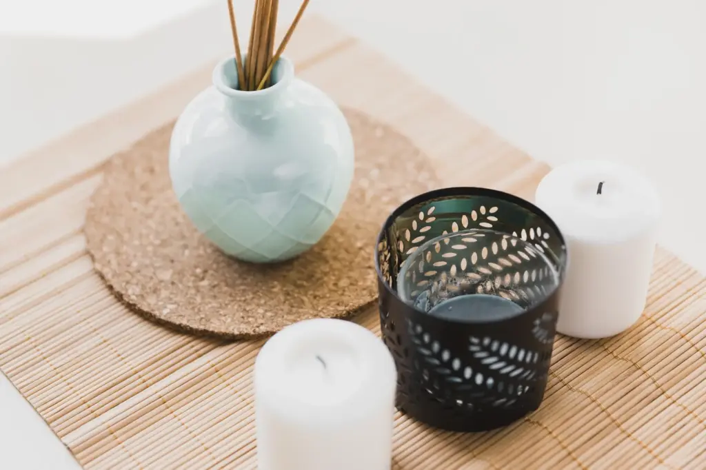
Materials, Holders, and Safety with Character

The right holder serves beauty and responsibility. Ceramics add tactility; glass shields flames; metals anchor verticality; stone disperses heat reliably. Choose non-porous surfaces or add protective plates, and respect clearances from art, curtains, and greenery. Trim wicks, level surfaces, and never leave flames unattended. Safety details are part of the aesthetic story, proving thoughtful homes care for people first while textures, patina, and craftsmanship create enduring, lived-in charm that invites slow evenings together.

Vignettes and Focal Points around the Home

Compose moments that guide the eye and encourage lingering. Anchor with a tray, add height variation, then weave in greenery, art, and tactile layers. Think in odd numbers, echo a color twice, and leave breathing room so flames can dance safely. Map sightlines from doorways and sofas, ensuring the best view catches natural light by day and atmospheric glow by night. Rotate pieces monthly to keep curiosity alive, and invite friends to share theirs.

From Day to Night: Layering Light and Mood